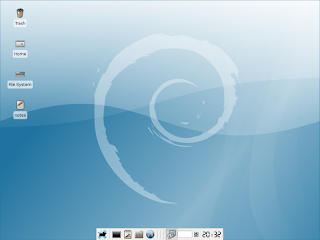
Debian is one of my favorite distros; but in terms of look, I hate it. At each release, I am hoping for visual improvements but each time I get disappointed. Etch is no different, the artworks are unpolished, the icon set (Rodent on the Xfce desktop) is prehistoric and in general, the desktop has a poor aesthetic appearance. These issues prompted me to redesign the entire desktop and create a visual environment that is pleasant to work with. Take a look at the screen-shot below.
This is the default desktop:
In order to get the result I wanted, I decided on the following design steps.
1) Create a new wallpaper
2) Find a new icon set
3) Customize the icons, take out the ugly icon label backgrounds; also create a customized start button.
4) Customize the panel
5) Redesign the splash screen
6) Redesign the GDM screen
Creating a new wallpaper was a simple enough task. After a few hours of experimenting with the Gimp I came up with the following image (click to enlarge).
I tried many color schemes but I kept the blue because it made me feel relaxed.
In step two, I had to find new icons that could replace the horrible looking Rodent icon set that was the default on Etch. On the gnome-look site, after a short search I found the Nimbus icons that have become my instant favorite.
You can find Nimbus here.
Next, I got rid of the icon label backgrounds. Unfortunately, Xfce adds non-transparent label backgrounds to the icons making them look visually distracting, especially on darker backgrounds.
This is the code that makes the label backgrounds disappear.
style "xfdesktop-icon-view" {
XfdesktopIconView::label-alpha = 0
#Text colors you can delete these if you want you use gtk theme colors
fg[NORMAL] = "#ffffff"
fg[SELECTED] = "#00ff00"
fg[ACTIVE] = "#0000ff"
}
widget_class "*XfdesktopIconView*" style "xfdesktop-icon-view"
I pasted these lines in the .gtkrc-2.0 file in my Home directory. The code also lets you change the font colors.
Next, I created a new start button because I preferred a Debian specific artwork to the Xfce mouse icon.
This is the button.
I replaced the the Xfce icon with the new Debian one in the pixmap directory and it appeared in the panel instantly.
The next step is the panel. I personally don't like it on the top or the bottom of the screen. I prefer it on the side. Luckily, the new Xfce customize panel dialogue lets you place the panel in any position you want. So I put it to the left side of the screen. I also wanted to change the color of the panel. Because Xfce doesn't let you change the default panel color you have to insert additional lines of code in the .gtkrc-2.0 file to be able to accomplish this.
This is the code.
style "panel"
{
bg[NORMAL] = "#909599"
xthickness = 0
ythickness = 0
}
widget_class "*Panel*" style "panel"
widget "*Panel*" style "panel"
class "*Panel*" style "panel"
I changed the panel color to dark brown. The x and y coordinates in the code handle the proper icon scaling.
Now, the desktop started to look pretty good. Take a look at the screenshot below.
The redesigned desktop (click to enlarge).
I also redesigned the splash screen to go with the new artworks. This is the final product.
There was one more thing left to do, creating a new GDM theme. For the background, I re-used the wallpaper and created a new artwork for the user name and password entry box.
These are the artworks.

The place for these artworks is the /usr/share/gdm/themes/debian-moreblue directory.
And this is the final GDM look (click to enlarge).
Gimp Interface Magic
You can download a sample version of the book from here.
The full version of the book is available from Lulu.
You are here: Home > Reviews > Beautifying Debian Etch
Friday, March 30, 2007
Beautifying Debian Etch
Labels: Reviews
Subscribe to:
Post Comments (Atom)


3 comments:
The zoomed out view doesn't do those icons justice. My first thought was, "why on earth would he use those?" Then I looked at them close up and I realized they have a lot more character at their actual size. This is a beautiful finished product.
What you have done is simply beautiful. However, it is unfair to blame Debian for how XFCE looks. XFCE is a very simple windowmanager. Debian is a collection of applications NOT a WM. If you don't like it, all you have to do is exactly what you did and change the graphics. If you want a more beautiful experience without as much hassle, try KDE 4.1 when it is officially released. It should be very nice and pleasing to the eyes. Gnome 2.22 is also very nice (although it takes a bit of customization to make it truly beautiful)
Post a Comment